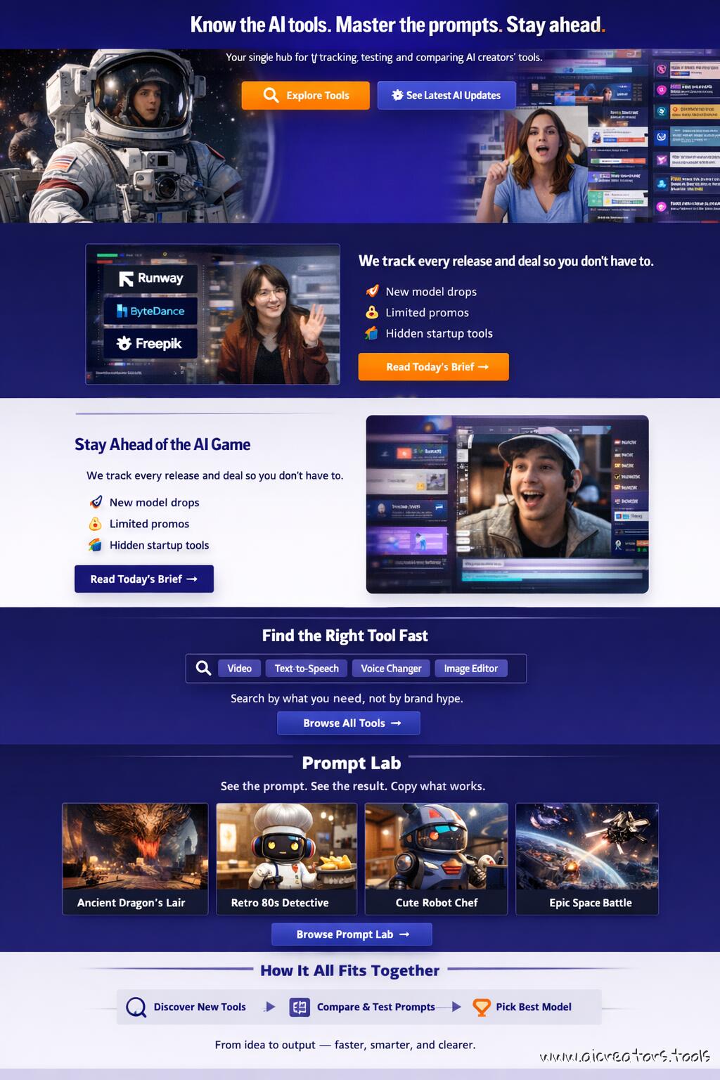
This is an AI image generation comparison for
text-to-image  prompt:
Design a modern web page for AIcreators.tools. Style Colors: Indigo Ink #27187e, Cornflower Blue #758bfd, Periwinkle #aeb8fe, Platinum #f1f2f6, Princeton Orange #ff8600 Use short sections, icons, and real visuals (no abstract waves). Tone: confident, not corporate. Layout Hero — Clarity Hook Purpose: instantly explain what the site is and why it matters. Visual: split screen or motion loop (AI video snippets, glitch-style feed). Headline: Know the AI tools. Master the prompts. Sta...
Log in to see full prompt.

Tested: November 29, 2025
Modern web page design test

Tested: December 5, 2025
Modern web page design test. Picked auto 2K resolution so it generated this wide image. Text is quite good. Layout is a metter of taste, I guess.


Tested: February 18, 2026
Wow, what? Recraft V4 Pro model does full page layout design ... like a pro. This is Nano Banana level.
Is the layout shown as a modern, scrollable single-page website mockup (not an abstract collage)?
Are realistic interface elements used instead of decorative waves or gradients?
Are the five specified brand colors (Indigo Ink #27187e, Cornflower Blue #758bfd, Periwinkle #aeb8fe, Platinum #f1f2f6, Princeton Orange #ff8600) visible and balanced across sections?
Does the tone feel confident and creator-oriented, not overly corporate or generic?
1️⃣ Hero Section – “Clarity Hook”
Is there a split-screen or motion loop feed showing snippets of AI video interfaces or glitch-style feed visuals?
Is the headline text “Know the AI tools. Master the prompts. Stay ahead.” clearly readable?
Is the subheadline present: “Your single hub for tracking, testing, and comparing AI creators’ tools.”?
Are the two CTAs visible and distinct: Explore Tools and See Latest AI Updates?
Does typography contrast well with the background (e.g., white or light text on indigo)?
2️⃣ Stay Ahead of the AI Game Block
Is the horizontal layout correct (image/UI mockup left, text right)?
Does the left image area show a radar-style feed or news ticker featuring recognizable AI brand logos (Runway, ByteDance, Freepik)?
Are the three bullet points (“New model drops,” “Limited promos,” “Hidden startup tools”) clearly visible as distinct lines?
Is there a visible CTA button labeled “Read Today’s Brief →”?
3️⃣ Find the Right Tool Fast
Does this section use a dark or indigo background to differentiate from others?
Is a central search bar mockup present, with chip-style dropdowns (Video, TTS, Voice Changer, etc.)?
Is there a button labeled “Browse All Tools →” below or beside the search bar?
If animated, does a sample query appear or type itself out smoothly (no motion glitch or illegible text)?
Check out the results from Freepik (Nano Banana 2.0) vs Fal AI (Seedream 4.5) vs ChatGPT's Image Generator by OpenAI (GPT Image 1.5) vs Recraft (Recraft V4) for similar or identical prompts side-by-side.
Iridescent capybara handdrawn mixed media
Papercraft origami dogs football
Real guitarist with illustrated effects
Model biting melting popsicle closeup
Parfait macro food photography
Cinematic closeup of intense male face