This is an AI image generation comparison for
text-to-image  prompt:
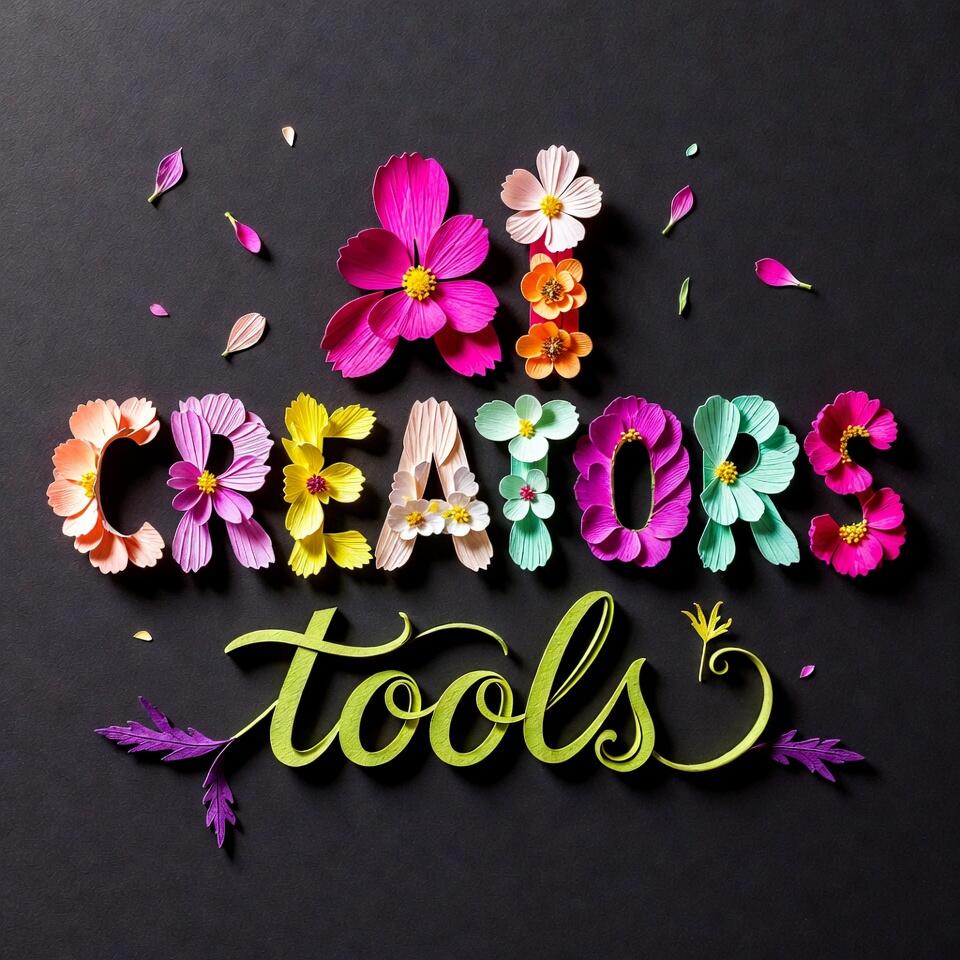
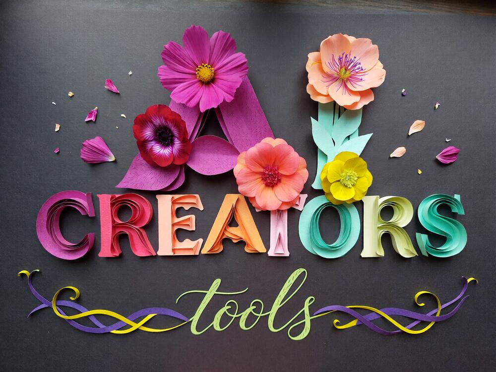
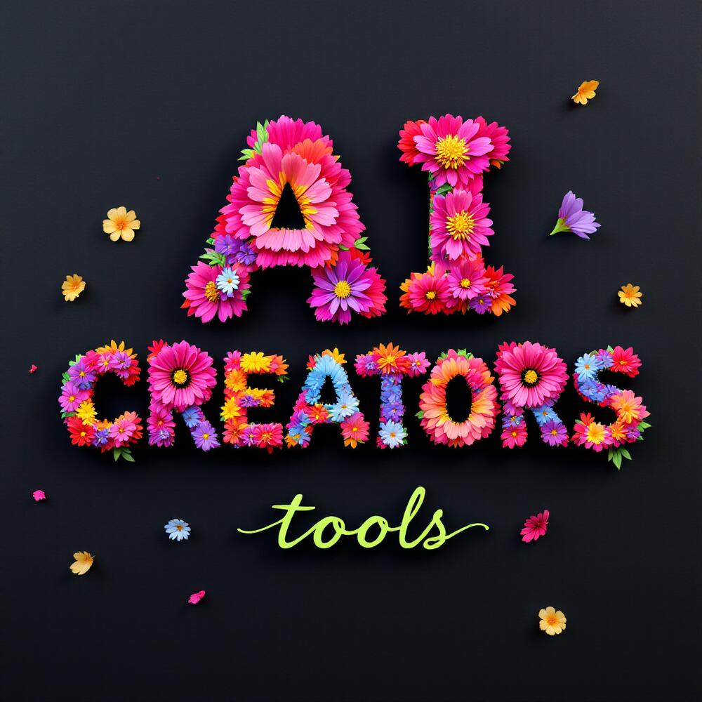
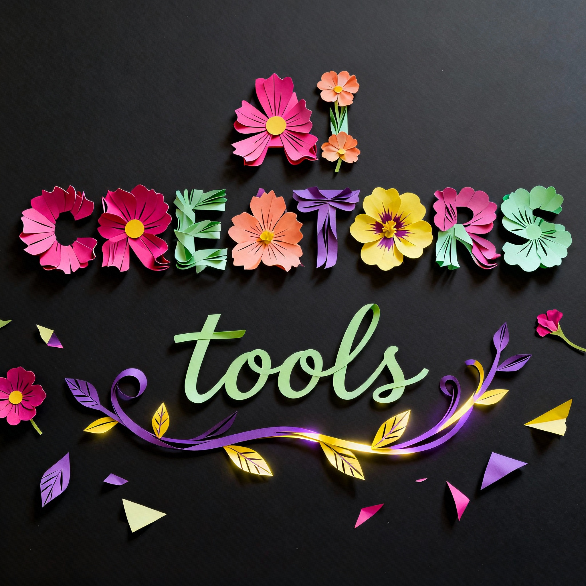
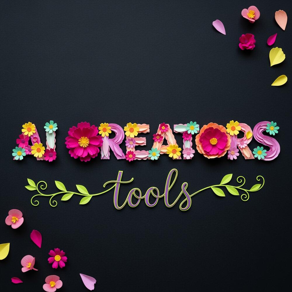
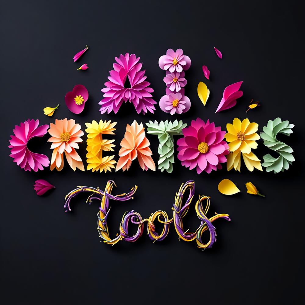
Flat-lay arrangement of vivid, multicolored paper-cut cosmos and begonia flowers forming the word “AI CREATORS” on a dark matte-black background. Text: “AI CREATORS” crafted entirely from layered paper flowers—each petal precise, slightly curled, and arranged to shape every letter clearly. Below, the word “tools” is written in a delicate, flowing lime-green vine script, made of intertwined purple and yellow paper vines that curl and twist naturally. Material: crisp cut paper with visible edges, ...
Log in to see full prompt.
Tested: November 16, 2025
Grok Imagine can work with creative typography with no problems.
Tested: November 16, 2025
This model takes instructions very literally, prioritizing over beautification/aesthetics it seems
Tested: November 16, 2025
Flux 1.1 is good with short words and stylization
Tested: November 16, 2025
Tested: November 16, 2025
Tested: November 16, 2025
Very nice.

Tested: November 29, 2025
Paper flower typography test looks nice but slightly out of focus for some reason.
Is the composition a flat-lay shot viewed directly from above?
Is the word “AI CREATORS” fully legible and formed entirely from layered paper flowers?
Do the flower petals show precise cuts, slight curls, and visible layered paper edges?
Are the paper textures visible with soft fiber detail and gentle bends for realism?
Is the word “tools” positioned below “AI CREATORS,” written in a vine-like script?
Are the vine letters made of intertwined purple and yellow paper with visible veins and natural curls?
Do the colors (magenta, fuchsia, peach, lemon-yellow, mint-green) appear vibrant and distinct?
Is the background a deep matte-black paper surface with no additional props?
Are the shadows soft and consistent, showing even top lighting?
Are scattered petals or paper fragments present to suggest handcrafted authenticity?
Is the composition balanced and centered, maintaining clear letter spacing and open counters?
Check out the results from GROK (Grok Imagine v0.9 Image) vs ImagineArt (ImagineArt 1.5) vs Magnific (Freepik) (Flux 1.1) vs Magnific (Freepik) (Seedream 4.0) vs Magnific (Freepik) (Imagen 4) vs Reve (Reve Image 1.0) vs Hugging Face (Ovis-Image) for similar or identical prompts side-by-side.


